Feature

吕涛

Lu Tao

01

在与摇滚乐相关联的音乐类型中,

+ 12 archived media items

在与摇滚乐相关联的音乐类型中,

在中国发展尤其繁荣。这种通常不借用人声与歌词表意的音乐注重构建 “声音图景”

并使用视觉作为整体艺术表达的一部分。除了经常出现在现场演出的巨幅投影画面,后摇滚唱片针对不同尺寸包装选用的图片及装帧方式经常极具特点,与音乐共同传递出抽象表现主义的倾向。

Among the wide array of rock music genres, post-rock really stands out, especially in China where it has grown

incredibly popular. This genre takes a unique approach to music: instead of using vocals or lyrics to tell a

story, it focuses on crafting immersive "soundscapes". Visual elements are also a key part of its artistic

expression. Besides the frequent presence of large-scale projection visuals at live performances, post-rock

albums often feature distinct images and framing styles tailored to different album formats. This visual

design, along with the music itself, tends to convey a strong sense of abstract expressionism.

惘闻乐队作为目前中国最具代表性的后摇滚、器乐摇滚乐队之一,于 1999 年成立于大连,成军 21 年来,发行超过 10

张以上录音室专辑。作为一支产出稳定且持久的老牌劲旅,惘闻乐队的稳步发展富有连续性又不失惊喜。细心乐迷对于惘闻声音鞭辟入里的分析自然是阐释乐队抽象艺术的一个角度,而聚焦惘闻过往专辑在视觉上的突破同样不失为理解惘闻音乐世界的重要线索

—— 这些设计也或多或少从不同角度映射出中国摇滚乐唱片设计取向的变迁。

Wang Wen, a band that has emerged as one of the most influential forces in China's post-rock and instrumental

rock landscape, originated in Dalian in 1999. With a remarkable journey spanning 21 years, they have produced

over 10 studio albums. As a long-standing veteran in the music scene, it has achieved remarkable and

consistent growth, while still managing to surprise their audience. Devoted fans delve deep into their

distinctive sound, which offers a unique and abstract artistic perspective. Moreover, a careful examination of

Wang Wen's visual creations in their previous albums reveals crucial insights into their musical universe.

These artistic designs, each with its own significance, shedding light on the evolution of Chinese rock album

aesthetics from various perspectives.

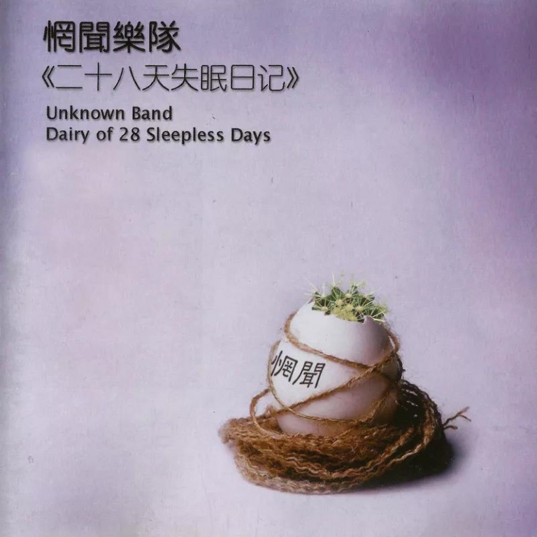
惘闻的第一张专辑

是一张结合

的专辑封面,封面右下方放置了一颗被麻绳缠绕的“惘闻”鸡蛋,从鸡蛋的破口能看见内在有个长满尖刺的仙人掌,视觉上呈现矛盾、冲突感,似与惘闻当时传达的音乐及心境不谋而合;封面的左上方则写着惘闻乐队及专辑的中英文名称,英文团名

“Unknown Band” 像是在说“名字其次,用心感受音乐就好”。

The debut album by Wang Wen, titled "Diary of 28 Sleepless Days," showcases a captivating blend of

photography and set design. The album cover features a striking image—a "Wang Wen" egg tightly

wrapped in hemp rope, with the shattered shell revealing a cactus adorned with sharp spikes. This

visually impactful presentation depicts a palpable sense of contradiction and conflict, mirroring

the music and atmosphere that Wang Wen sought to convey. In the top left corner of the cover, the

band's name, "Wang Wen," appears alongside the album title, presented in both Chinese and English.

Notably, the English band name, "Unknown Band," seems to suggest that the essence of Wang Wen's

music transcends mere labels and resides in the immersive experience it offers.

洗炼的设计反衬音乐旋律的柔和线条,

飘逸的封面尽显乐队当下时期的狂放与力量感;惘闻的专辑设计伴随乐队自身的声音发展,在持续演进过程中总试图传递新的情绪和感受。这样的心思在乐队第十张录音室专辑《看不见的城市》的实体设计上尤为明显。

The design of "0.7" complements the gentle melodies of the music with its soft, flowing lines. The ethereal

cover of "Eight Horses" captures the band's current dynamic energy and raw power. Wang Wen's album designs

evolve alongside their evolving sound, aiming to evoke new emotions and sensations. This intention is

particularly evident in the artistic design of their tenth studio album, "Invisible City."

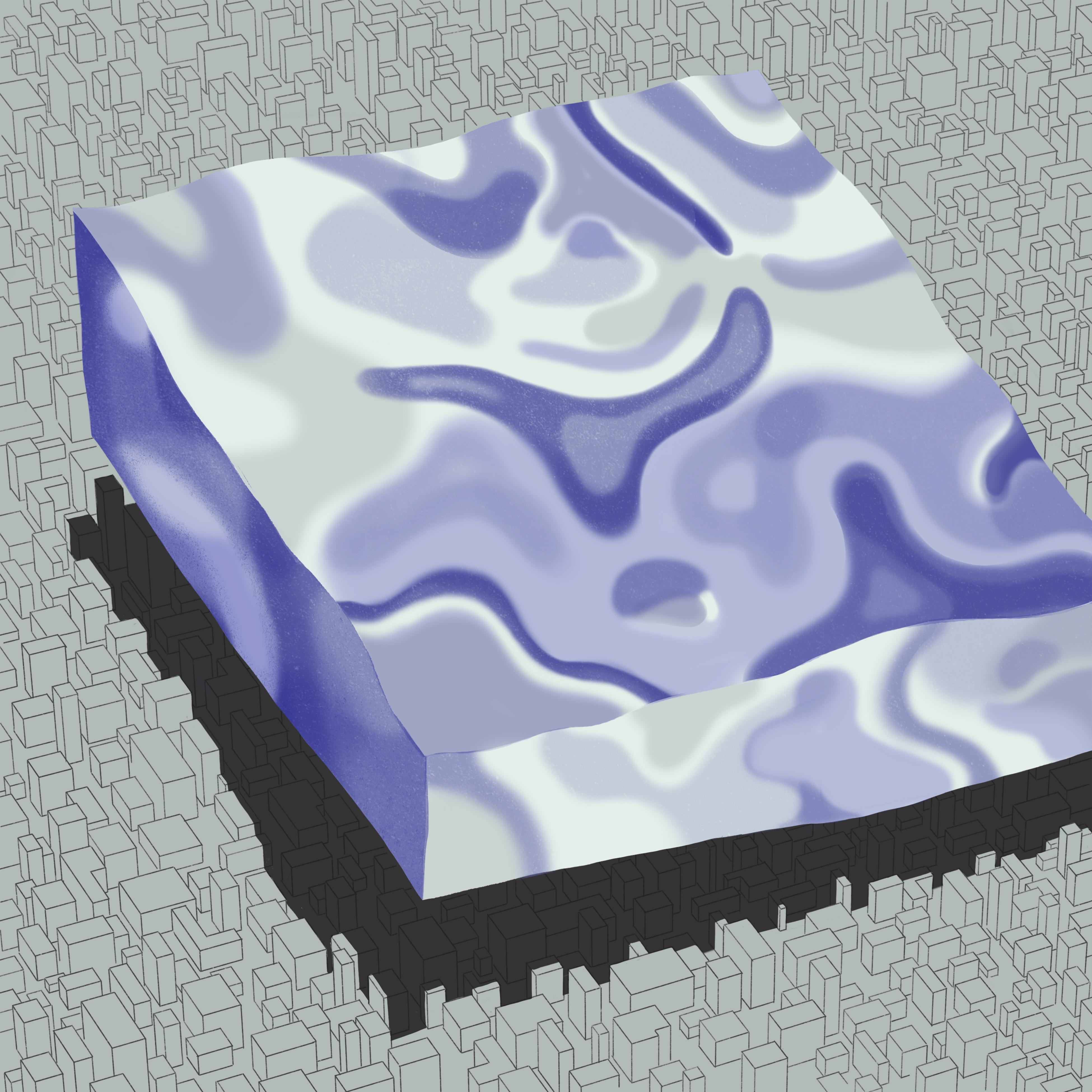
专辑封面来自于

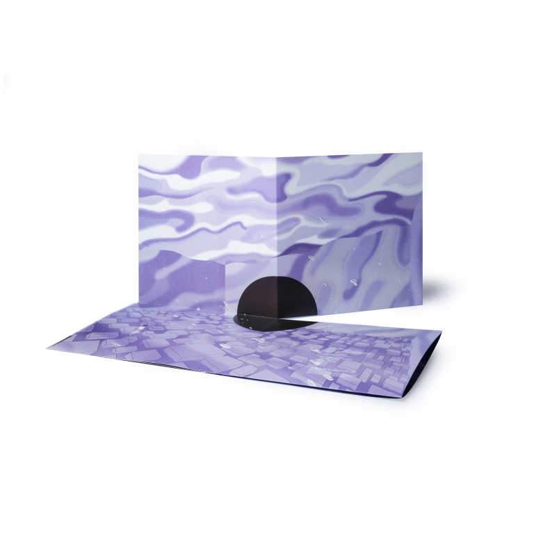
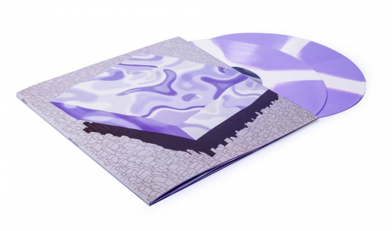
。他创作的四幅系列作品奇幻、唯美且柔软,描绘出城市场景之上(又或之中)“流水般的幻境”;而这些飘渺的感觉得以实体化,靠的是专辑的装帧设计师卢涛。他用巧妙的折叠和展开方式,将四幅作品串连起来,在每一次翻折中都能看到作品的全貌及局部,呈现“看不见的城市”的超现实想像。至于唱盘的部分,卢涛采用双色融合工艺,让整个视觉、听觉的感受既连贯又互为阐述。

The album cover, created by illustrator Cen Jun, showcases a series of four fantastical and delicate

illustrations depicting a "flowing dreamscape" set against urban landscapes. The intricate artwork beautifully

captures the surreal imagination of "Invisible City." Album designer Lu Tao skillfully integrates these

illustrations through clever folding and unfolding techniques, allowing viewers to appreciate both the overall

composition and the intricate details with each fold. The vinyl record itself features a dual-color fusion

technique, enhancing the visual and auditory experience in a cohesive and complementary manner.

中,主视觉的图像基本上决定了唱片封面给人的第一感觉,装帧设计师的角色更像是退到幕后的、作为连接音乐人和插画家的桥梁。在很多时候需要思考的是:如何用更适合的方式去呈现整体氛围的传达。

In "Invisible City," the album cover's primary visual image sets the initial impression for viewers. The role

of the album designer is more akin to working behind the scenes, acting as a bridge between the musicians and

the illustrator. Often, the designer needs to carefully consider how to capture and convey the overall vibe in

a more appropriate and engaging way.

2020年11 月惘闻乐队发行最新专辑

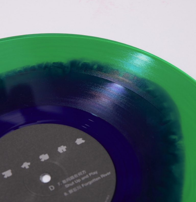
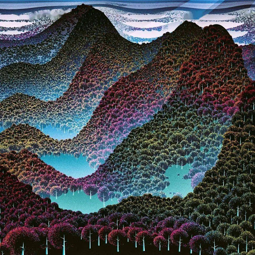
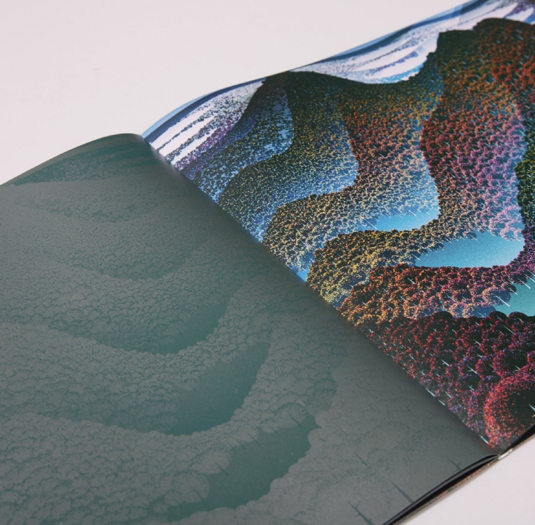
,再次邀请卢涛操刀装帧设计。唱片的封面选择阿根廷艺术家 Manolo Gamboa Naon 通过编写代码由电脑生成的作品。画作在生成前连艺术家也无法事先预料它的样貌,这正是生成艺术(generative

art)的魅力所在。在惘闻乐队的谢玉岗选定封面后,卢涛为了再现作品的迷离感,选择用光栅技术去模拟这种数字化的效果。而今年的疫情则为唱片生产增加了许多随机性及不确定性。各种过程中的 “未知” 也成为这张专辑隐形的参与者。

In November 2020, Wang Wen released their latest album, titled "100,000 Whys," and once again collaborated

with album designer Lu Tao for the album's design and packaging. The album's cover was crafted by Argentine

artist Manolo Gamboa Naon using computer-generated artwork created through coding. Its unique allure lies in

the fact that even the artist couldn't anticipate its appearance prior to its generation, showcasing the

captivating essence of generative art. After guitarist Xie Yugang selected the cover, Lu Tao skillfully

employed raster techniques to capture the elusive and digital essence of the artwork. The ongoing pandemic in

that year added an extra layer of unpredictability and uncertainty to the album's production, with the

"unknown" becoming an invisible yet influential participant throughout the various processes.

同样地,《十万个为什么》在设计前已选定了封面的主视觉图像,视觉上给人的感觉大概有一个初步想象,装帧设计师在这里的工作就是要将图像及音乐有效地串连在一起,同时将如何刺激听、视觉外其他感官纳入综合考虑。譬如纸张的触感、油墨的气味及工艺的感受等细节都会影响最终消费者打开、翻阅及聆听等整体的音乐体验。出乎意料的是,统率所有工序的主旨在卢涛看来恰恰是不要有

“设计” 的欲望,而重在不让设计成为 “多余的元素” 。

In the case of "100,000 Whys," the primary visual image for the album cover had already been chosen before the

design process began, providing a general idea of the visual impact it would create. The album designer's role

is to effectively bridge the image with the music, while also considering how to engage the senses beyond just

sight and sound. Factors like the paper texture, ink scent, and overall craftsmanship all contribute to the

holistic music experience for the end consumer when they open, flip through, and listen to the album.

Surprisingly, the guiding principle throughout all these processes, as described by Lu Tao, is to resist the

urge for excessive "design" and instead focus on keeping the design subtle.

到了2022年,卢涛再次为惘闻的唱片《辛丑|壬寅》做了平面及实体唱片装帧设计。经过他的灵感解构,

实体唱片设计层面,我们和卢涛老师以及老朋友四色印刷在制作前期仔细地核对了纸张用料、封套尺寸、印刷颜料,每一方对细节的重视和把控,让《辛丑|壬寅》顺利诞生,而且是大家理想中的模样——一张记录时代的唱片。

In 2022, Lu Tao once again led the design of Wang Wen's album, " Painful Clown & Ninja Tiger," encompassing

both the visual graphics and physical presentation. Through inspired deconstruction, the calligraphic font of

"Painful Clown & Ninja Tiger" became the centerpiece of the album cover, arranged in a captivating collage

style. The font was enlarged and overlapped to create a powerful and intense visual impact, shaping the

overall perception of the era alongside the music. During the production phase, careful attention was given to

every detail, including the selection of paper materials, the dimensions of the album sleeve, and the choice

of printing pigments. This meticulous approach, in collaboration with our trusted partners at Four-Color

Printing, ensured the seamless creation of " Painful Clown & Ninja Tiger," capturing the essence of the times

and bringing our ideal vision to life.

回顾卢涛过往执行的音乐项目会发现,他的设计大多从概念及内容着手,再通过调研梳理逻辑,一步步形成视觉画面,设计的过程理性且克制。

Looking back at Lu Tao's previous music projects, it is evident that his designs are rooted in concepts and

content. Through thorough research and meticulous organization, he carefully develops visual imagery,

approaching the design process with a rational and restrained mindset. A prime example of this approach is

seen in his concert posters for Zbigniew Karkowski, Yao Dajun, and Li Jianhong. These posters are created

using ASCII code conversions, incorporating the performers' names, time, and venue information. Printed on

vibrant trifold sheets, they exude a sense of computational order, resonating with the experimental nature of

以他为 Zbigniew

Karkowski、姚大钧、李剑鸿设计的演出海报为例,海报基于 ASCII

码转换生成演出者的名字、时间及场地等活动讯息,并印在彩色三联单上,给人一种计算机的秩序感受,也和三位演出者的实验音乐属性相互呼应。

作为一位喜爱声音艺术的平面设计师,卢涛从不吝啬分享他对音乐视觉的观点。他投入大量时间阅读、研究地下音乐的历史及视觉脉络,并保持不断的输出。他曾在一场讲座上表示:从行动美学到美学产出的过程十分重要,不管是音乐人还是设计师,都要走到基层,置身于生产的环节中,有产量出来,把它当成一个商品进行交换,美学的实践才有意义。

As a graphic designer with a passion for sound art, Lu Tao is always eager to share his perspectives on the

visual aspect of music. He dedicates a significant amount of time to reading and studying the history and

visual trends of underground music while maintaining a continuous output. During a lecture, he expressed the

importance of the process from aesthetic action to aesthetic production. Whether one is a musician or a

designer, it is crucial to get involved at the grassroots level, immerse oneself in the production process,

generate output, treat it as a commodity for exchange, and give meaning to the practice of aesthetics.

而他除了设计工作外,有时还是地下音乐会的组织者、设计展的策展人及视觉文化写作者。他以个人的实践探索着设计师的可能性,用自身的设计专业介入更多领域。新的沟通模型正在发生。

In addition to his design work, Lu Tao sometimes acts as an organizer of underground music events

(designer as organizer), a curator of design exhibitions (designer as curator), and a writer on

visual culture (designer as author). Through his personal exploration and multi-faceted approach, Lu

Tao expands the possibilities of being a designer and brings his design expertise into various

fields, acting as an organizer of underground music events, a curator of design exhibitions, and a

writer on visual culture. This holistic approach to communication is giving rise to a new model that

embraces the interconnectedness of design and diverse creative disciplines.

惘闻的作品集合如一座 “看不见的城市”,体势庞大,又如幻象般飘渺;在它繁复的结构中有着 “十万个为什么” 的机巧设计;而卢涛这样的视觉工作者正通过自己审慎的设计语言为站在城池大门前的听众提供了一把打开脉络的钥匙。

Wang Wen's body of work can be likened to an expansive and ethereal "Invisible City." Within its intricate

structure, we find the cleverly designed album "100,000 Whys." Visual practitioners like Lu Tao, with their

meticulous design language, provide the audience standing at the gates of this city with a key to unlocking

以下为来自媒体「别的BIEDE」的作者 yuchenghsiao 对卢涛的采访问答。

Below is an interview with Lu Tao, conducted by Yuchenghsiao, an author from the media outlet "Biede."

更多关于卢涛的信息...

卢涛常以“套套卢”网络称谓模糊自我身份定位,活跃于中国当下文化创作领域,打通商业传播与设计、写作评论的界限。秉承视觉写作精神,近年偏重独立出版、Info-graphic

及编辑设计。近年来,卢涛多次受邀参加大声展、北京设计周、中国设计大展、亚洲平面设计双年展、宁波国际设计双年展、首尔国际文字设计双年展(Typojanchi 2013)、第十届上海双年展。

2009年 成立联合视务/Design United,涉足从主流媒体包装到亚文化的视觉经营及推广

2009年 与方闲海启动“黑哨诗歌出版计划”,推动中国当代诗人的诗歌出版

2011年 和迷盒成立Deadline设计组,携手JNBY创立文化反堵杂志《COVER》

2012年 策划“企鹅图书封面设计亚洲巡展”(北京-杭州-首尔)

2013年 成立跨媒体文化团体『BUS公交委员会』

2014年 担任上海双年展城市馆系列展设计总监

2017年 参与碧山民艺计划

2017年 与宛青、邵年成立XYZ Lab,策划“幻景:中岛英树展”,2019年4月被国际知名设计媒体 It’s Nice That 采访。

2018年 成立“学习组”,力图融通视觉研究、设计考古、活动分享、展览策划及写作出版。

For more information about Lu Tao...

Lu Tao, also known as "Tao Tao Lu" in online circles, is a highly regarded figure in China's contemporary

creative scene. He effortlessly blurs the lines between commercial communication, design, and critical

writing. With a passion for visual storytelling, he has been actively involved in independent publishing,

info-graphics, and editorial design in recent years. Lu Tao's work has been showcased in various

prestigious exhibitions and events, including the Loud Design Exhibition, Beijing Design Week, China

Design Exhibition, Asia Graphic Design Biennial, Ningbo International Design Biennial, Seoul International

Typography Biennale (Typojanchi 2013), and the 10th Shanghai Biennale.

2009: Founded Design United, engaging in visual operations and promotion ranging from mainstream media

2009: Launched the "Black Whistle Poetry Publishing Project" with Fang Xianhai to promote the publication

of contemporary Chinese poets' poetry.

2011: Established the Deadline design group with Mibox, collaborated with JNBY to create the cultural

anti-blockage magazine "COVER."

2012: Curated the "Penguin Book Cover Design Asian Tour Exhibition" (Beijing-Hangzhou-Seoul).

2013: Founded the cross-media cultural group "BUS Public Committee."

2014: Served as the Design Director for the Shanghai Biennale's Urban Pavilion series exhibition.

2017: Participated in the Bishan Folk Art Project.

2017: Established XYZ Lab with Wan Qing and Shao Nian, curated the "UNREAL SCENE: HIDEKI NAKAJIMA"

exhibition and was interviewed by the internationally renowned design media It's Nice That in April 2019.

2018: Established the "Study Group," aiming to integrate visual research, design archaeology, event

sharing, exhibition curation, and writing publishing.

「壬寅造访」系列

后摇滚(post-rock)

《28 天失眠日记》

摄影及布景设计 (set design)

Diary of 28 Sleepless Days,

《八匹马》

s current dynamic energy and raw power. Wang Wen

插画师岑骏

《看不见的城市》

“辛丑壬寅”书法字体以装饰拼贴的方式构成了专辑封面的主要部分,放大字体直至占满整个画面、压迫感十足的笔画相互交错……这些设计点和专辑音乐一同构成了人们对于时代的感受。

Penguin Book Cover Design Asian Tour Exhibition

Fascinating people are always drawn to each other.

Painful Clown & Ninja Tiger,

`[艺术家] 卢涛`

02

访谈 / Interview

Q

初次听惘闻乐队的新专辑《十万个为什么》是什么时候,当时有什么样的感受?有没有哪一首歌给你留下鲜明的印象?

When did you first listen to Wang Wen's latest album "100,000 Whys," and what were your initial impressions? Was there a specific song that stood out to you?

7 月下旬。聆听惘闻基本都是进入了一种连绵的氛围。间断地听了几遍后,有一次在一曲结束后暂停下来特意看了一下曲名 —— “假若明天来临”,比较应景 2020。

I first listened to Wang Wen's latest album "100,000 Whys" in late July. Their music has a way of creating a captivating ambiance that draws me in. As I listened to the album intermittently, there came a moment when I paused after a song and took notice of the track title - "If Tomorrow Comes." It felt incredibly fitting for the year 2020.

A
Q

《十万个为什么》的专辑封套使用光栅技术来呈现阿根廷艺术家 Manolo Gamboa Naon 的作品。为什么选择这个工艺?制作上是否有遇到困难?另外,在唱片的内页中采用原色及烫银来诠释作品的细节,以及专辑内分别有两张不同颜色的彩胶,用意为何?

Why was the decision made to use raster techniques in presenting the artwork by Argentine artist Manolo Gamboa Naon for the album packaging of "100,000 Whys"? Were there any challenges encountered during the production process? Furthermore, the inner pages of the record showcase the interpretation of the artwork through primary colors and silver foil stamping. Additionally, the album includes two different-colored vinyl records. What was the intention behind these design choices?

以前和白冈冈讨论他给腰乐队设计的那张《相见恨晚》时我们谈到视觉手法和音乐的关联性的问题,需要设定一个边界。《相见恨晚》在设计上对打口 CD 的借用从而表达和打口时代的告别,问题在于腰的这张专辑音乐本身是不是和这个概念具有强相关性?有的时候设计和音乐是并行的,不然只要是成长于打口时代的任何一支乐队都可以抢用这种形式先机。

反过来如果形式和内容具有强相关性,那么即便已经存在的形式你也是可以复刻或挪用的,这个不等同于普遍意义上的 “抄袭” ,这里取决于语境。如果只是以近似性来质疑原创性,这是草率的。

When discussing the design of "Better Late Than Never," the album I collaborated on with the band Kidney, Bai Ganggang and I delved into the interplay between visual techniques and music, and the importance of establishing boundaries. In the design process of "Better Late Than Never,” we incorporated the concept of a punched CD as a symbol of bidding farewell to the era of physical CDs with punched holes. However, a question arose regarding the extent to which the music itself on the Waistband's album was directly related to this concept. It is not always the case that design and music align perfectly, as simply capitalizing on the format of punched CDs would not capture the essence of any band that emerged during that era.

On the other hand, when there is a strong correlation between form and content, it becomes possible to replicate or appropriate existing forms. However, it is important to note that this does not necessarily imply "plagiarism" in the conventional sense. Context plays a critical role in this discussion. Jumping to conclusions about originality based solely on similarity is hasty and careless.

A
Q

回到《十万个为什么》这张上,在整个疫情期间,我们陷于因为各种数字连接产生的迷幻感——每天接收到的各种南辕北辙反转又反转的信息,Manolo Gamboa Naon 无尽复制的数码作品,惘闻疑无前路而又峰回路转的 “10000 Whys” ……它们都交织成了一种迷离。

Returning to "100,000 Whys," throughout the entire pandemic period, we found ourselves immersed in a surreal atmosphere shaped by various digital connections. Each day brought contradictory and ever-changing information. The digital reproductions crafted by Manolo Gamboa Naon and Wang Wen's intriguing journey, filled with moments of doubt and unexpected twists in "100,000 Whys," all these elements intertwine, creating a sense of ambiguity.

Manolo Gamboa Naon 的作品实际更适合屏显,前期我们用错版及以荧光色替换四色印刷的方式做了尝试,结果这种迷离效果还是出不来。光栅效果的好处是有了空间感,在画面替换中产生律动和不确定性,有机材料更接近数字些。内页采用了左右镜像,一个原色+荧光色,另一个退到蓝灰里面,大的结构上也算是种幻境。

今年受疫情的影响,有些原材料有点紧张。《十万个为什么》在制作上要分配到不同个地点,始终伴随着偶发性。谢玉岗说的对:“没有一次没有瑕疵的”,这可能是我们继续下去的理由。

Manolo Gamboa Naon's artwork is particularly well-suited for display on screens. During the early stages, we conducted experiments involving misprints and replacing four-color printing with fluorescent colors, aiming to achieve a desired sense of ambiguity. However, we were unable to achieve the intended effect. The use of the raster effect brings certain advantages, such as creating a sense of depth and introducing movement and uncertainty during image transitions. This effect enhances the overall visual experience by adding a dynamic quality to the artwork. Additionally, the choice of organic materials in the design brings a unique tactile quality that resonates with the digital nature of the artwork. The inner pages feature mirrored images, one with vibrant primary colors and a touch of fluorescence, while the other embraces a captivating blue-gray tone. Together, these design elements contribute to the creation of a fantastical realm.

This year, we encountered material shortages caused by the impact of the pandemic, which presented challenges throughout the production of "100,000 Whys.” The production process of the album had to be distributed to different locations, further adding to the complexity of the process. As Xie Yugang aptly put it, "Perfection is never attainable.” Perhaps, it is this very realization that keeps us motivated to continue pushing forward.

A
Q

到了惘闻2022年这张《辛丑|壬寅》,还是你为这张专辑做了平面及实体唱片的设计。能简单聊聊这张唱片的设计理念吗?

Let's shift our focus to Wang Wen's album "Painful Clown & Ninja Tiger" released in 2022. Once again, you took charge of the graphic and physical album cover design. Can you provide a brief overview of the design concept behind this cover?

以寅丑二字相互交错、钳制的主体视觉体现了在这个特殊时间段内生活和创作的状态——陷于困顿之中的挣扎和突围。

The intertwined and restrained characters of “Painful Clown & Ninja Tiger” visually depict the state of existence and artistic expression during this period. They symbolize the struggles and breakthroughs experienced while navigating through a sense of stagnation.

A
Q

作为惘闻乐队⻓期的合作伙伴,你觉得他们的音乐是否有所变化?而每一次你在落实这些音乐想像时,又有什么一以贯之的元素及理念?

As someone who has collaborated with Wang Wen for a long time, have you noticed any changes in their music? And when translating their musical visions into a design, what are the key elements and concepts that you consistently adhere to?

其实跟惘闻接触也就是这几年,和他们成队二十年比算是很新近了。我觉得他们比较好一点是摆脱了对后摇的期待性程式,他们现在或许正在去往某一处的路上。而给惘闻设计的一个特点是在设计之前他们已经选定了某个艺术家的作品作为主视觉,我的工作是在对声音的想象和这个艺术图像之间造成连接,这个体现在看见及打开唱片的那个过程里。很重要一点:不要有 “设计” 的欲望。

Actually, my collaboration with Wang Wen has been more recent, considering their two-decade-long presence in the music scene. One interesting development I've noticed is their departure from trying to fit into the traditional mold of post-rock. They are now embarking on a journey towards something different and unique. When it comes to designing for Wang Wen, they already have a specific artist's work chosen as the primary visual even before the design process begins. My role is to establish a connection between their imaginative sounds and this chosen artwork, which becomes evident when you see and open the record. One important aspect in this process is to ensure that the focus remains on the essence of the music and the overall experience it delivers, rather than getting caught up solely in the desire for elaborate design elements.

A
Q

你参与过的音乐项目⻛格跨度不小。作为一个艺术家,你是否会偏爱具备某些特点(共性)的(不同)音乐?

When it comes to the musical projects you've worked on, you've explored a wide range of styles. As an artist, do you prefer music that has specific characteristics or qualities in common?

作为一个设计师,需要提防的就是 “偏爱”,这有点不职业。“共性” 是它们应该是好的音乐。

As a designer, it's crucial to avoid personal "preferences" since it can hinder professionalism. What matters most is that the music is simply good.

A
Q

在处理不同音乐类型的项目时,你的设计流程会有所区别吗?你会从哪方面考量视觉传达的重点?

Do you approach your design process differently when working on projects that involve different music genres? What factors do you take into account when prioritizing visual communication?

基本上是先听,有初步想法了然后和对方沟通。重点在于不要成为多余的元素。

Basically, I start by listening to the music and getting a general idea, and then I discuss it with the other party. The important thing is not to add unnecessary elements.

A
Q

现在数位串流平台盛行,音乐被消费的方式已发生改变。对你而言,实体唱片现今的价值为何?新媒介的盛行对你的设计思路有无影响?

With digital streaming platforms becoming increasingly popular, the way we listen to music has drastically changed. In your opinion, what is the significance of physical records in today's digital age? Have advancements in new media influenced your design process?

实体唱片的价值一部分是因为一些“遗老”的使用习惯,另一部分是一部分有点厌倦了在线消遣的人突然发现实体唱片居然成了人群划分的一种手段,最后一点它附着了人的气息及遗憾。Space Circle 厂牌有一个着力点我觉得挺好 —— 让更年轻的并非原有受众来到现场,实体唱片怎么和这些人群产生互动是我们特别关注的。

Physical records hold value for two main reasons. Firstly, they appeal to people who appreciate the experience of owning and playing tangible music. It's like having something real and personal in their hands. Secondly, physical records have become a way for individuals who are tired of digital entertainment to express themselves and connect with like-minded people. They see physical records as a statement of their identity and belonging. And let's not forget, physical records also have a special charm and bring back nostalgic feelings. For the Space Circle label, they are doing something cool. They are focusing on attracting a younger audience who may not have been into physical records before. We pay special attention to how physical records can connect with this audience and create a unique experience for them.

A
Q

唱片设计在现今整个快消文化的社会背景下是否有未来性可言,突破口在哪?

Do you think album design has a future in today's fast-paced consumer culture? And where do you see the breakthrough point?

唱片设计本身就是一种过去的方式,如果要有 “突破口” 的话关键看音乐是以怎样的方式传递到人的。“未来” 是一种线性思维,对不同的人群存在着不同的(视觉)传达方式。

Album design itself is a thing of the past. So, when we talk about a "breakthrough point," it really depends on how music is being conveyed to people nowadays. The concept of "future" isn't as straightforward as we might think. Different audiences have different preferences and respond to visuals in unique ways.

A
Q

国内唱片发行中,有哪一张专辑的设计令你印象深刻?

Among domestic album releases, is there a particular album design that has left a deep impression on you?

除了之前提到白冈冈设计的那张《相见恨晚》。还有就是五条人的《梦幻丽莎发廊》,由冯火(朱建林、冯伟敬)设计。

Besides "Better Late Than Never" designed by Bai GangGang, another album that has made a lasting impression on me is "Dreamy Lisa Salon" by Wu Tiao Ren and its album is designed by Feng Fo (Zhu Jianlin and Feng Weijing).

A
Q

你第一次作为设计师参与的音乐项目是什么?它与你当时接触的其他视觉设计项目有什么区别?

What was your first experience as a designer working on a music project? How did it set itself apart from other visual design projects you were engaged in at that time?

应该是 02 年给 “井唱片” 设计的 logo,这是一个短暂存在的地下厂牌,记忆中好像只出了《从三墩到武林广场——杭州地下音乐合辑》(2002)这一张,这是一张很多人参与的唱片,大家正好处在一种忘我投入,将肾上激素转换成高分贝音乐/噪音的时代,它记录了杭州曾经作为一个国内地下及实验音乐源发地之一的早年片段。对于我来说这是一个没有先前经验的开始,精神上带着 90 年代的 “铁托” 气息。与之对应的是,当时我在一家知名的广告公司担任设计总监这样的职位,我们的日常工作是面对农夫山泉、浙江卫视这样的主流客户,以及马上就要开启的淘宝网。看上去两极的东西也是可以统一的。

One of my earliest music projects as a designer was the logo design for "Jing Records" back in 2002. It was an underground label that had a relatively short existence. The only album I recall them releasing was titled "From Sandun to Wulin Square - Hangzhou Underground Music Compilation" (2002). This album brought together a passionate community of artists who were deeply involved in creating high-decibel music and noise, capturing a fragment of Hangzhou's early years as a hub for underground and experimental music in China. At that time, I had no prior experience in such projects, but it marked the beginning of my journey, fueled by the spirit of the 90s "die-hard fans of Rock music" era. Interestingly, alongside my work on the underground music scene, I held the position of design director at a renowned advertising company, where our daily focus revolved around mainstream clients like Nongfu Spring, Zhejiang TV, and the emerging Taobao platform. It was a unique experience to navigate these seemingly contrasting elements and find a balance between them.

A
Q

2018 年你为了完成哈萨克音乐大师拜力汗·哈力阿克拜尔《空中漫步》的装帧设计都做了哪些调研工作,有没有什么 “意外” 收获?

In 2018, what research did you undertake for the set design of the album "Air Walk” by the Kazakh music master Beilkhan Haliakbar? Did you encounter any unexpected discoveries?

在摩登天空世界音乐厂牌正式重启之前,2016 年 6 月底该厂牌负责人张晓舟组了一个团,从乌鲁木齐南山到喀什的刀郎之乡麦盖提,对几位少数民族音乐大师进行了一周左右的访谈、录音录影录像等工作。拜力汗是系列重启出版的第一张,此后张晓舟等人又先后多次入疆录制,可以说在与时间赛跑,因为留给老艺人的时间不多了,特别遗憾的是维吾尔族刀郎木卡姆大师吐尔逊还没等到他的专辑出版就在 18 年去世了。

如果要说收获的话,你会通过这种类型的工作思考很多:少数民族音乐的生存状态,“世界音乐”的定义及其历史背景,不同厂牌的重心……其实通过大量资料和内容的展开,设计应该安静地退到后面去。

Before the official relaunch of the Modern Sky World music label in late June 2016, director Zhang Xiaozhou assembled a team and embarked on a journey from Nanshan, Urumqi to Makit, the hometown of Dolan in Kashgar. Their purpose was to conduct interviews and capture audio, video, and footage with various ethnic music masters. For approximately a week, they immersed themselves in this enriching experience. The first release in this series was "Air Walk" by Beilkhan Haliakbar. Following its release, Zhang Xiaozhou and the team made multiple trips to Xinjiang to record more music, aware that time was limited, particularly for the older artists. Unfortunately, it is with deep regret that Uyghur traditional Muqam musician and master Turson passed away in 2018 before his album could be released, leaving behind a sense of profound loss.

When reflecting on the gains from this kind of work, it prompts contemplation on various aspects. Questions arise about the survival of ethnic music, the definition of "world music" and its historical context, and the priorities of different music labels. Through extensive research and content exploration, design should humbly step back and assume a supportive role, allowing the music and its message to take center stage.

A
Q

你和 XYZ Lab、非白工作室曾策划“幻影 - 中岛英树”的展览,将好的设计作品带给更多人知道。你觉得平面设计除了展览的形式外,还有什么方式能与大众进行对话及交流?

You've collaborated with XYZ Lab and Transwhite Studio to curate the "UNREAL SCENE: HIDEKI NAKAJIMA” exhibition, showcasing excellent design works to a broader audience. Apart from exhibitions, how do you believe graphic design can actively engage in dialogue and communication with the public?

展览是将 “设计” 人为剥离出来的一种形态,更多的只是满足视觉的愉悦。好的作品更应该作为消费品在大众使用过程中得到愉悦的体验。

Exhibitions, as a medium, often isolate or disconnect design from its practical application in everyday life. While exhibitions offer visual enjoyment, their limited scope may not fully capture the essence of good design. The idea being conveyed is that truly exceptional design should not be confined to exhibitions but should instead be experienced and enjoyed by the public in their everyday interactions with consumer products.

A
Q

未来有什么计划及安排?

What are your future plans and upcoming activities?

更均衡地产出吧。

To achieve a more balanced production

A
Q

谢谢你,套套卢!

Thank you, Tao Tao Lu!

Comments